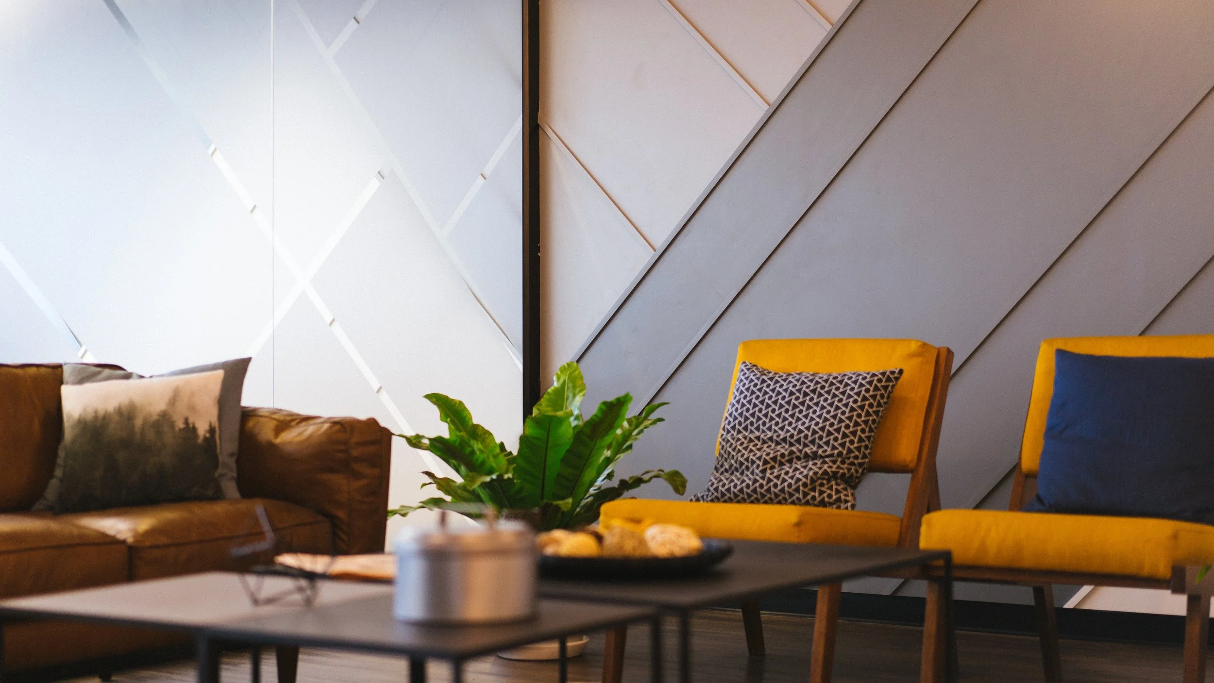
Nearly halfway through 2018, FCA reflects on the top design trends of this year. We look at new possibilities in lighting as LED technology moves forward. We consider creative ways to incorporate elements of nature in design. We discuss the color of the year, the use of residential finishes in commercial design, and the pop-ups that seem to be popping up everywhere.
TREND 1: CIRCADIAN LIGHTING
What is circadian lighting?
Circadian lighting is dynamic lighting designed to mimic the changes in natural lighting during the cycle of the day. From morning to night, the color temperature of daylight changes. Incandescent lamps produce warmer light (around 2700 K), while “cool white” fluorescent lamps produce cooler light (around 5000 K). The color temperature of daylight starts out low and shoots up as midday approaches. At the peak of the day, color temperature outside may be around 6000 K. As the sun begins to set, color temperature falls and light becomes warmer. Light turns from blue-white to the orange-y hues of dusk.
Our bodies go through natural processes tied to the 24-hour clock that may be impacted by our exposure (or lack of exposure) to light. Electric lighting based on the circadian rhythm has been shown to increase productivity in work environments and improve patient outcomes in healthcare settings. Nurses and doctors may be more comfortable and may perform better, benefiting patients. In assisted care facilities, where a majority of residents often have trouble sleeping, circadian lighting may improve residents’ quality of sleep. Other benefits include increased alertness in the morning, improved concentration and mood, reduced hyperactivity, reduction in errors and accidents, and faster cognitive processing.
Today, manufacturers are offering a variety of tunable white lights – lights that can be adjusted within a range from warm white to cool white. Lights may be controlled by a user or with a control based on an astronomical time clock, so that lights automatically adjust based on location and time of year.
TREND 2: BIOPHILIC DESIGN
Design that acknowledges our need to be connected with the natural world
Incorporating nature in design has been trending for many years. Biophilic design, however, acknowledges the many ways we can achieve this in different aspects of design.
A visual connection to nature
The most basic method of incorporating nature: provide a view to elements of nature and natural processes.
Non-visual connections with nature
This could be achieved through a water fountain producing sounds of trickling water, weather (wind, rain, hail) that can be heard, operable windows that allow natural ventilation during good weather. A nature analogue is highly textured fabric that mimics natural materials.
Non-rhythmic sensory stimuli
Photo: Chinnian
This refers to sporadic connections with nature that occur at unpredictable intervals. Cloud movement, billowy fabric that moves with wind, and shadows or dappled light that change over time are all examples of non-rhythmic sensory stimuli.
Biomorphic forms and patterns
Biomorphic forms and patterns are contours, patterns, or numerical arrangements that persist in nature. The Golden Angle is the angle between florets in some flowers. The Fibonacci series is a numeric sequence found in many living things, like the spacing of leaves on some plants.
Material connection with nature
Natural elements that are minimally processed, like wood grains, leather, and stone stimulate visual and sometimes tactile senses.
Complexity and Order
This refers to rich designs or patterns with a spatial hierarchy similar to those found in nature. Humans have exhibited positive physiological responses to fractal geometries in found nature. Nested fractal designs expressed as a third iteration of the base design are more visually pleasing.
Prospect
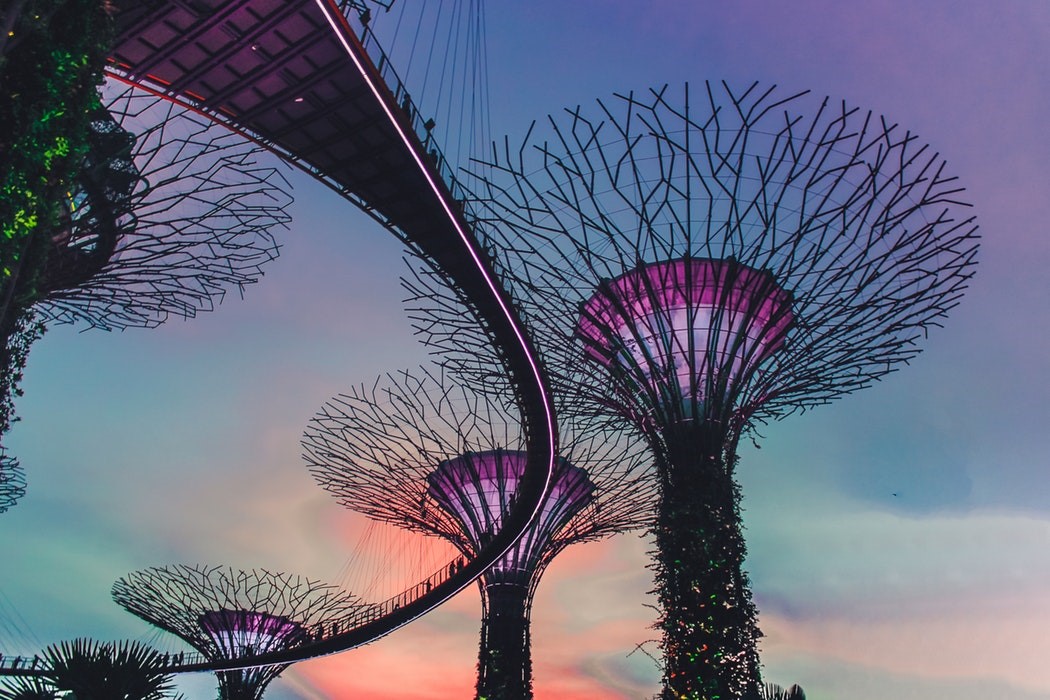
Spaces with a good sense of prospect have long unimpeded views that permit surveillance over a distance. Good prospect may instill a sense of safety and control in individuals. This may be achieved through elevated planes, balconies, and catwalks.
Risk/Peril
The risk/peril component is when an identifiable threat is paired with a reliable safeguard to produce an exhilarating feeling. Although this category may seem contradictory to the objective of safety in the last pattern, it’s important to note that no real danger exists. Some examples of this effect are infinity edges, cantilevers, and glass bridges or walkways.
Refuge
Refuge is a protected space for withdrawal from the main areas of activity. Cubicles and high-backed chairs are examples of this type of biophilic design.
Mystery
Design that includes mystery offers the promise of more information to entice individuals to further explore the space. Partially obscured views, curving edges that slowly reveal, translucent materials, and dramatic shade and shadows are all methods of achieving mystery.
Other categories of biophilic design:
Changes in temperature and airflow
Dynamic and diffuse light
Connection with seasonal and temporal changes
TREND 3: COLOR OF THE YEAR 2018
Mystery | Experimentation | Creativity | Intrigue | Counterculture | Mindfulness
Pantone has announced the color of the year: Ultra Violet 18-3838. A bold and saturated hue, we expect to find tones of this color in accents, artwork, and furniture. Once reserved as a color for royals because of the difficulty in achieving intense purple pigmentation, purple still carries a connotation of richness. Purple also falls between the warm and cool colors – it can be either.
“We are living in a time that requires inventiveness and imagination. It is this kind of creative inspiration that is indigenous to Pantone 18-3838 ultra violet, a blue-based purple that takes our awareness and potential to a higher level. From exploring new technologies and the greater galaxy, to artistic expression and spiritual reflection, intuitive ultra violet lights the way to what is yet to come.”- Leatrice Eiseman, executive director of the Pantone Color Institute
TREND 4: "RESIMERCIAL" SPACES
Commercial spaces with residential finishes
This trend has been on the rise for a few years and continues to gain popularity. We’re now seeing residential finishes in all types of commercial spaces- even hospitals and health care facilities which used to define the “institutional” look. The goal is to provide a more comfortable environment, reduce stress, and promote productivity. It is now the industry standard to provide informal areas for relaxation and collaboration. These flexible spaces are meant to accommodate varying activities and encourage interaction between individuals.
Key components of resimercial design:
- Tactile textures that feel warm
- Multi-sensory elements, like plants that you can smell, see, and touch
- Variability – a palette of places to choose from including open rooms for group work and secluded areas for individual work
- Layouts that facilitate movement and interconnection
- Horizontal layouts, rather than vertical layouts (the “campus” format) lead to more circulation and minimize the sense of hierarchy
TREND 5: POP UPS
What are pop ups?
Pop ups are temporary spaces where retailers sell products, food, or experiences. There are pop up restaurants, pop up clothing stores, pop up yoga classes, even pop up museums. In the Bay Area economy, retail space is often too expensive for small businesses to maintain month after month. Enter sharing culture. Like ride sharing, clothing rentals, and AirBnB, shared retail space is the solution for many businesses.
Pop ups offer an element of exclusivity – they are temporary, underground, for those in the know. Pop ups are selling an experience. The pop up format also encourages shoppers to buy now, because tomorrow the pop up may be gone. Pop ups are a great way to market seasonal products or test the waters with a new product or restaurant.
How will pop-ups affect architecture moving forward?
A successful pop up needs only to shine brightly for a moment, then fade away. Yet, it seems the format of pop ups is here to stay.
Lobbies and plazas may be designed with a more flexible layout to permit installations like pop ups. We may see fewer singular purpose built-in components that dictate how a space is used. Pop ups seek interaction from the public, so spaces may be designed to attract attention. Temporary installations offer a chance for architects and designers to make bold and daring decisions because who knows – it may be gone tomorrow.


